Heart Analyzer v10 Brings New Dashboard and Watch App Experience with Enhanced Swift Charts

Heart Analyzer this week reached version 10, bringing some major improvements and changes to the popular heart health app including a new dashboard experience, a refreshed Watch app, enhanced charts, and new tracking complications.
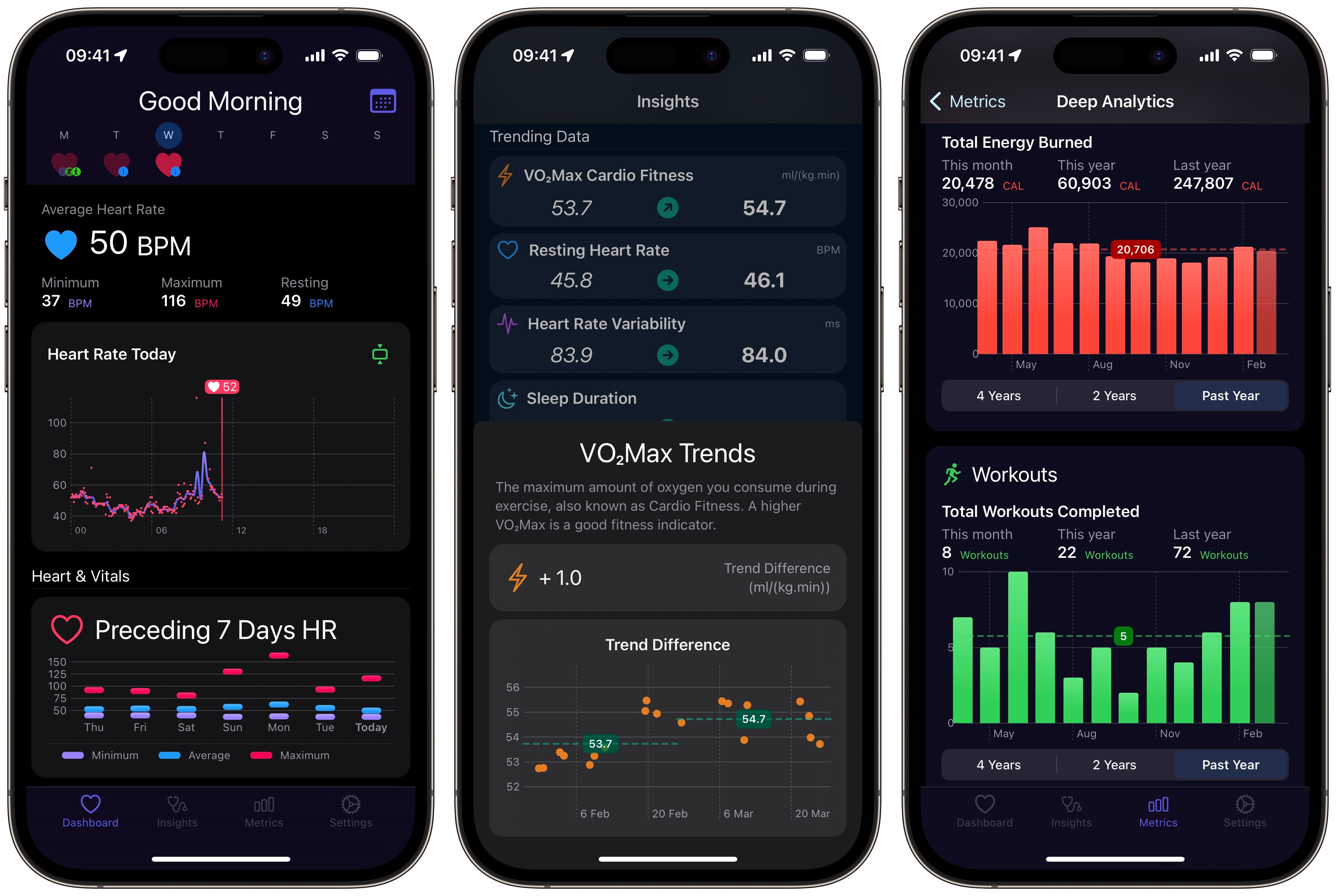
The new Dashboard experience has been designed lets users switch days more easily and aims to offer clearer indications as to which day the user is looking at, while still offering a summary of heart rate and other Vital Health data for each day. In addition, Dashboard cards have all been refreshed, while for app Customization Premium users, the Health types can now be filtered and sorted based on personal preference.
Another change in version 10 is the renaming of “Heart Home” to “Insights.” Here users can view updated metrics and charts on various Vital Health types. There are trend comparisons for the past 30 days to the preceding 30 days, and the Heart Reports have been updated to use the new Swift Charts for more visually compelling and accurate displaying of Health data.
The adoption of Apple’s Swift Charts framework in particular is a highlight of the app. As the developer explains in a blog post:
Up to now, Heart Analyzer has relied mostly on custom charts made to display Heart Rate summaries on your wrist, graph your recent heart rate in a complication and so much more. These charts were ground breaking at the time, but Swift Charts allows me to modernise the app with ever more precise and readable charts.
If you’re running iOS 16 and WatchOS 9, you’ll find these new charts throughout the app. With line, bar, area and range charts implemented across the app, visualizing your data has never been easier. For Blood Oxygen Saturation, Heart Rate Variability and Respiratory Rate Heart Analyzer now offers updated range charts.
These charts continue to indicate average values for the day, but the vertical bars now represent 10th and 90th percentiles of the data. Markers still also indicate the day’s maximum and minimum values. These percentile bars offer better comparisons between day to day changes by ensuring spikes in the data have less effect on the overall picture.In addition to new charts, the Deep Analytics section of the app now includes new Health types. Cardio Fitness and Sleep Time averages are available to track over the past four years alongside updates to all the other types. The Custom Heart Rate Zones feature has also been updated and now allows users to track this zone on the Dashboard.
Meanwhile, over on the Heart Analyzer app for Apple Watch, a new app layout houses watchOS 9‘s enhanced Swift Charts, which means that all charts can now be tapped to reveal additional detail. Complications have also been refreshed, and there’s a new Recent HRV complication that works in conjunction with the new Apple Health AFib History feature and shows the last 12 hours of HRV data.
The new Heart Analyzer v10 update is free for both non-paying and premium users with devices running iOS 16 and watchOS 9. The app also continues to offer Premium features via one-time purchases with no subscriptions via the App Store.
This article, “Heart Analyzer v10 Brings New Dashboard and Watch App Experience with Enhanced Swift Charts” first appeared on MacRumors.com
Discuss this article in our forums


