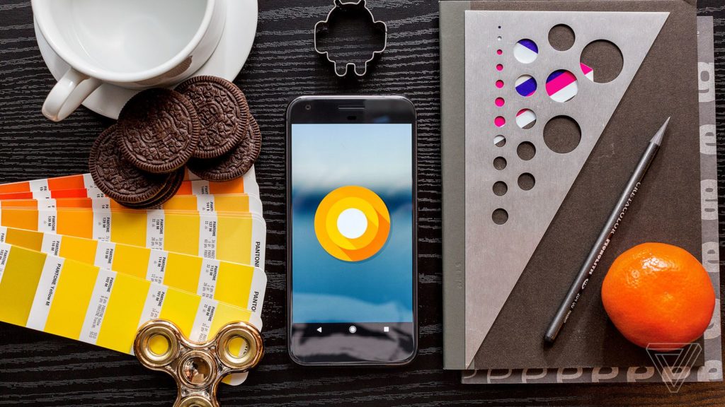
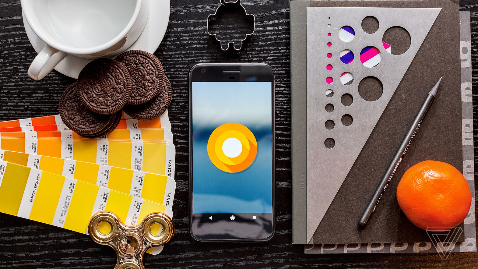
ANDROID OREO REVIEW: IT’S WHAT’S INSIDE THAT COUNTS
E
Every year, each review of the new version of Android has to come with a bunch of caveats — and the same applies to Android 8 Oreo. Android reviews are always about the future, not the present. Unlike iOS, you may not get the features you’re reading about here until you buy your next phone. It’s possible that your current phone will be updated, but it is going to take months of waiting and wondering if and when that will happen. The only sure way to get timely updates to Android is to buy a Pixel phone directly from Google.
Google has tried to convince its partners in the Android ecosystem to solve these update problems over the years with cajoling, shaming, and begging. With Android Oreo, it’s trying a new tactic that feels much more Google-ly: engineering.
The most important part of Android Oreo is something called Project Treble, but it’s not something you can see and use. Think of it as modularizing and compartmentalizing the guts of Android so that it’s simpler for Google, manufacturers, and carriers to get updates pushed through to you. But this is Android, so it’s not guaranteed to happen.
In the meantime, there are a few user-facing features worth talking about, even though only a tiny percentage of Android users will get them sometime soon.
/cdn.vox-cdn.com/uploads/chorus_asset/file/9129833/akrales_170824_1933_0029.jpg)
NOTIFICATIONS
Notification overload is very real. If there’s a screen that’s more valuable than your home screen, it’s your lock screen. So, app developers are shameless in finding ways to get their app to pop up there.
In Oreo, Google is trying to solve the problem by giving you more options for dealing with these pop-ups. The home screen now features notification dots on your icons, so you can see what’s new, just like on iOS. Unlike the iPhone, however, Google chose not to put any numbers on those dots. You can long-press the icon to see a tiny, truncated version of that app’s notification and swipe it away.
/cdn.vox-cdn.com/uploads/chorus_asset/file/9216667/Screenshot_20170910_092244.png)
Dots are nice, I guess, but my favorite new feature in Oreo is the more readable notification shade, which orders your alerts by priority. The “Major Ongoing” alerts for things like playing songs or navigation will be pinned to the top slot, so they don’t get lost. Below that is a section Google calls “People to People,” for messaging alerts. Then, there’s “General” for everything else, and a new section called “BTW” that’s shoved down to the bottom.
It sounds like a lot, but in practice what you get is a well-ordered list of the stuff you need, easily acted upon right there. If you have a million notifications, the less-important ones are buried at the bottom in that little BTW list that only expands as you scroll down. There’s even a nice little animation as icons pop up from the BTW zone to the main area.
BTW is also useful because Oreo weirdly demands morenotifications from certain apps. Oreo is going to start getting harder on apps that run in the background and apps that put stuff over your screen (like Facebook Messenger’s Chat Heads). Those apps are going to have a bunch of persistent alerts, which sounds awful, but they’ll be hidden away in BTW. Basically, it will mean that apps that hog resources will be called out and you’ll have the option to kill them, but they won’t be called out so loudly that it will annoy you.
Oreo layers on more functionality, too. Media apps get notifications that dynamically change color to match the theme of cover art, and they look nice. I also like the option to “snooze” notifications like you might do for an email, at least in theory. You can do this by slowly sliding the pane over to tap a little clock icon. Unfortunately, you can’t snooze anything for more than two hours.
Then there are “Notification Channels,” which is an utterly confusing new array of notification options for apps. Basically, an app can tell Android that it has multiple types of notifications — like marketing, messaging, reminders, whatever — and allow you to set up different notification rules for each category. It’s a nice idea, but we’re already suffering from notification management fatigue and just giving users a million more settings options seems like the wrong solution. App developers also need to opt in to this new system, to boot.
Android has always been great at letting you jam through notifications quickly. You can scroll and swipe away stuff you don’t care about, reply directly inline, and the lock screen is always the exact same as the real notification shade. Notifications are still grouped by app, so the ones that send a lot are collapsed to just a couple lines; you can just expand it to see them all.
Notifications are awful, but Android does a much better job than iOS of helping you deal with them quickly. In fact, it’s stunning to me that Apple doesn’t borrow more of Android’s behavior. That lead is extended in Oreo, though I suspect the vast majority of users won’t bother with some of the new advanced features here.
/cdn.vox-cdn.com/uploads/chorus_asset/file/9129825/akrales_170824_1933_0015.jpg)
REFINEMENTS AND OTHER FEATURES
You won’t get lost in the new UI changes in Oreo, but you will notice that nearly everything around the core OS has been nipped, tucked, and generally cleaned up. The Quick Settings area at the top of the notification shade is white now. The main settings app has been simplified to a much shorter list of top-level options. And Google has blessedly decided it’s okay to have stuff like the sleep timeout available in multiple places so you won’t have to hunt for it as often.
/cdn.vox-cdn.com/uploads/chorus_asset/file/9216681/emoji.jpg)
There are new emoji. They are not blobs. There’s apparently a whole design system for this new emoji to make it faster and easier for Google to create new ones. The new emoji are closer in appearance to how they look on other platforms, so there will be less confusion, I suppose. But they have less charm than the old blobs.
I’m one with the blob, the blob is me ༼ つ ◕_◕ ༽つ.
The Pixel home screen is relatively unchanged, but long-pressing an icon shows those aforementioned notifications and gives you an option to directly access that app’s widgets. You can also still drag shortcuts out of that little pop-up, one of Android’s least-appreciated features. Icons are “adaptive” now, which means they can change their shape to fit whatever theme you have on the home screen. Of course, that requires app developers to update them, and if my home screen is any indication, that’ll take awhile.
Although the Google App isn’t technically a core part of Oreo, allow me a brief aside to point out that Google is still constantly playing around with how to Google on Android. And I feel like the company is pulling a Samsung: quietly burying or killing features that were once highly touted as the future.
The biggest example is Google Now, which we might as well call Google Then. Now was the name for Google’s ability to provide you with ambient, contextual information before you knew you needed it. It would tell you when to leave for work, where your packages were, and even read your screen when you asked so it could intelligently figure out what you wanted to do next.
/cdn.vox-cdn.com/uploads/chorus_asset/file/9216683/Screenshot_20170910_092323.png)
All those features are still on the phone, but they’ve been buried or moved somewhere else. Swipe over from the home screen and the Google App defaults to showing you a feed of news instead of a personalized list of your ambient notification cards, which are hidden away under a new button. The Google Assistant does have a persistent “What’s on my screen” button, but it no longer really feels like it’s trying to do as much.
That Google would rather show a news feed by default than a personalized feed of directly relevant information based on my personal data is telling. It tells me that making Now cards relevant is a harder nut to crack than finding news stories based on what I’ve searched for. It also tells me that Google is still trying to find a way to make something as compelling as the Facebook News Feed. Good luck with that!
Still, there is a lot of machine learning in Oreo. Google says it’ll automatically try to select the right amount of text when you’re trying to grab a phone number or address, for example. Wi-Fi can automatically turn itself back on when it’s close to a trusted network. Android knows which passwords you have saved and can use them to autofill apps when you need to log in to them. It also makes it easier for password manager apps, such as LastPass and 1Password, to fill in password fields automatically for you, which, in theory, should encourage more people to use a password manager.
Lastly, there’s finally a picture-in-picture mode, which you trigger by hitting the home button when a video (or video call) is playing. However, app support for the feature is scattershot at best. You need to have YouTube Red, for example, to get YouTube videos to do it, but Netflix, HBO Now, and even Google Play Movies don’t support it yet.
/cdn.vox-cdn.com/uploads/chorus_asset/file/9129831/akrales_170824_1933_0035.jpg)
CORRALLING THE ECOSYSTEM WITH CODE
The most work done in Oreo isn’t user-facing, though. It’s all about a bunch of features designed to finally enforce better practices on other engineers: the ones who make apps and the ones who make Android devices themselves.
Project Treble is all about making it easier for Google to reduce the amount of time it takes for an Android update to get approved and pushed out to existing devices. Google calls it “a modular base for Android.” That means that Google is drawing sharper boundaries around what Android manufacturers like Samsung and LG can do.
IMPORT:TheVerge